EcoGen America
Illuminating the Path to Sustainable Energy
Branding
Role: Creative Direction | Design
CREDIT:
Brand Strategy - Diversion Agency
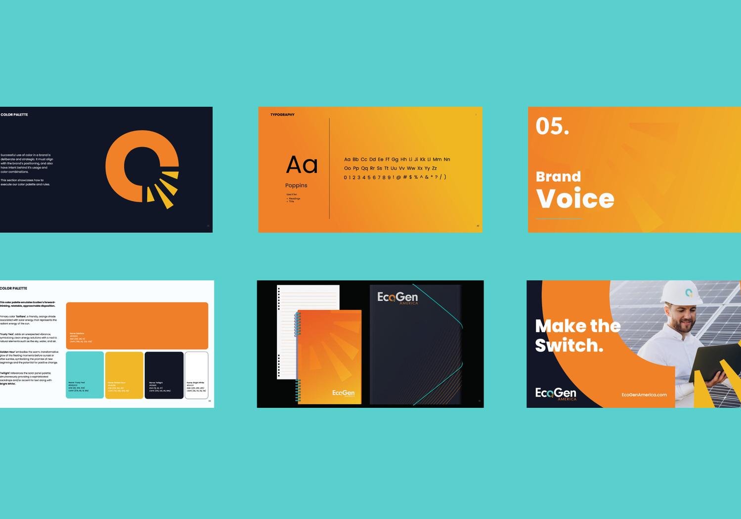
EcoGen, a solar energy company, wanted to rebranded to better communicate its commitment to sustainability and appeal to a wider audience. The new logo features a stylized sun in vibrant orange, symbolizing warmth and energy, with a teal accent representing trust and clean energy. The color palette, inspired by nature, includes shades like "Solflare" (orange) and "Trusty Teal," evoking warmth, optimism, and environmental responsibility. The brand voice is relatable, trustworthy, and informative, emphasizing the benefits of solar energy and EcoGen's dedication to customer satisfaction. Marketing materials consistently reflect this new identity, resulting in increased brand recognition and engagement.
RESULTS:
The rebranding effort has resulted in increased website traffic, higher lead generation, and improved customer engagement. EcoGen has received positive feedback from customers and industry partners, praising the brand's clarity,approachability, and commitment to sustainability. The new brand identity has not only elevated EcoGen's image but also contributed to its overall business success.