Domain money Assignment
In this assignment, my goal was to engage high-income professionals and previously disengaged clients by addressing their primary concerns—reducing financial stress and uncertainty. I focused on offering personalized, transparent financial plans that simplify their decision-making and provide clarity, fostering trust and long-term financial confidence.
META video ads
My Approach was to engage high earners feeling overwhelmed by financial complexity.
I highlighted transparency with no AUM fees and fiduciary advisors.
I used visuals showcasing user-friendly tools for managing cash flow, investments, and goal setting.
Key Benefit: Flat-fee model with ongoing support, reassuring prospects of simplicity and transparency.
Deliverables:
9:16 Vertical format
1:1 Square format
Email Banners
Email 1:
Headline: "Ready to Stop Stressing About Your Finances?"
Objective: Address general financial anxiety by promoting actionable steps through personalized plans.
Email 2:
Headline: "Cut Through Financial Confusion and Get Clear Advice Now"
Objective: Engage clients frustrated with previous advisors, offering clear, easy-to-follow advice.
Note:
Although the assignment was to create Email Banners, I needed to see the full picture so I created the entire email for impact.


Display Ads
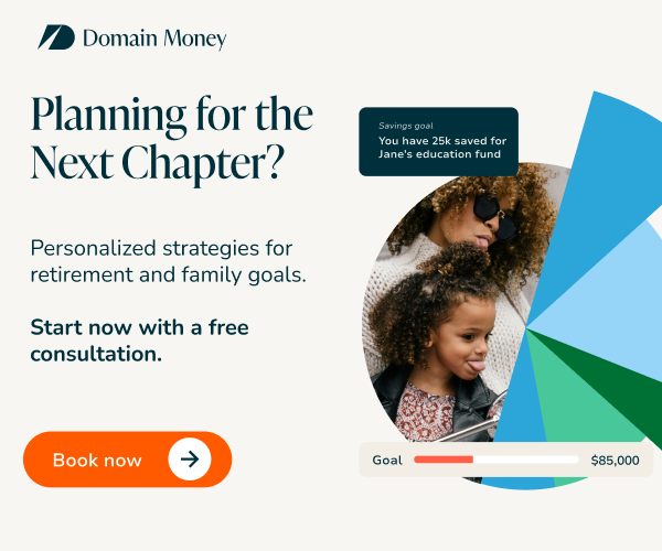
"Planning for the Next Chapter?"
Thought Process: Targeted individuals navigating life changes such as retirement and family planning. Messaging focused on future readiness with personalized strategies.
”Make smarter Financial decisions – tailored to you”
Thought Process: Positioned towards professionals managing complex finances, emphasizing ease and simplicity.
"Don’t let advisor fees eat into your growth"
Thought Process: The focus is on fee predictability by contrasting how traditional advisors charge more as investments grow, while Domain Money’s flat fee stays consistent, giving clients financial control.
”Say goodbye to fees that grow with your portfolio”
Thought Process: This ad emphasizes how flat fees protect investment growth, ensuring clients keep more of their returns instead of losing value to percentage-based advisor fees.
Deliverable:
300x250 - Inline Rectangle


Conclusion
These creatives aligned with Domain Money’s lifestyle-driven brand identity, addressing common financial pain points with tailored messaging. Display ads focused on transitional life stages, emails highlighted solutions for financial anxiety, and social media videos reinforced transparency and ease of use. The creatives created multiple entry points for prospects to engage, increasing the likelihood of conversion.
Landing Page feedback
Let’s talk about Domain Money’s landing page.
What Works
The page does a solid job at keeping things simple and transparent. The free strategy session is front and center, which is great. Visuals simplify complex services, and the flat-fee model builds trust by eliminating hidden fees.
Where It Could Be Better
I agree with the Client Retrospective, the social proof (success stories) can be expanded on—people need to see real testimonials on monetary impact or case studies to feel reassured. Also, the text feels a bit heavy, making it harder to skim.
Consider including a chart that compares the cumulative cost of a flat fee over the life of the investment versus the typical fees charged by other financial advisors, which scale with earnings or portfolio size. This would visually demonstrate how a flat fee structure provides more economic value over time, staying predictable regardless of portfolio performance.
What We Can Learn from Competitors
Facet Wealth does a great job with storytelling and real-life scenarios—something Domain Money could adopt to create a stronger emotional pull.
Range keeps it super clean and easy to read, which makes the experience feel effortless.
Edward Jones leans heavily on trust signals like reviews and awards, which helps prospects feel confident about taking action.
My Suggestions
Add more color to testimonials or case studies by showing results to build more trust. Simplify copy to make benefits stand out at a glance.
Additionally, I’ve noticed that the landing page and the ad CTAs that I’ve seen doesn’t quite align. The ads say “Book your free strategy session,” but the landing page only provides information without booking functionality, it creates a disconnect for the user.
Ideally, the CTA in the ad should match the action on the landing page. If immediate booking isn’t available, the ad copy could say something like:
“Get started with your free strategy session”
“Learn more and claim your free session”
Alternatively, adding a direct booking option or form on the landing page would make the process more seamless and consistent.

